Category Archives: Investing

How To Plan, Statement Goal, Savings Bonds Series, Weekly Payment Calculator, Credit Bureau Free, Chart Trading Patterns, Chart Analysis, Derivatives Credit, Derivatives Equity

Income Distribution United States

Income in United StatesIn a previous article I talked about Income in the United States. I showed who makes how much, what taxes are paid and what they spend that money on.

In this video I cover United States Income Distribution with a focus on how the wealthiest are able to avoid taxation. I also focus a great deal of attention on the corporations and Billionaires in the United States.

I provide a video, the entire presentation on Income Distribution and a list of the wealthiest Billionaires below.

Continue reading Income Distribution United States

Distribution of Wealth in America

Puzzled About DerivativesIn this video tutorial I explore the Distribution of Wealth in America. My two sources are the Federal Reserve Boards Survey of Consumer Finances and the IRS Tax Stats Reports.

Here you’ll learn just about everything about the Net Worths of Americans. Wealth distribution will be analyzed from every angle.

  • Who has the money
  • How do they invest it
  • Where do they work
  • Where do they live

Continue reading Distribution of Wealth in America

Medicare & Social Security

Medicare Social SecurityI created an article on how Medicare / Social Security got into their current state called Fix Social Security and Medicare. I never thought it would get much attention, but after I received a bunch of emails on it, I decided to create this presentation.

I don’t believe Medicare / Social Security will ever go away, no matter how many politicians say that it will. The fact is that without Medicare / Social Security 90% of US citizens could not afford to survive in the retirement years.

If you want to see the stats from this tutorial check out Fix Social Security and Medicare.

Continue reading Medicare & Social Security

Income in United States

Income in United StatesIn this article, I show you everything there is to know about income and taxes in the United States.

I’ve seen countless articles that focus on estimates and guesses on this subject. In this article I provide cold hard facts. You’ll be shocked by what I found!

My two sources are the Federal Reserve Boards Survey of Consumer Finances and the IRS Tax Stats Reports.

Continue reading Income in United States

Average Net Worth Americans

Net Worth Americans

After I created my article on income inequality and the US Economic Crisis I received numerous requests for more information.

Information on the Average Net Worth of Americans is readily available, and I’ll provide you with a bunch of pie charts and graphs that explain everything.

This information comes from two main sources. The Federal Reserve Boards Survey of Consumer Finances and a couple Reports from the IRS.

Continue reading Average Net Worth Americans

Fix Social Security and Medicare

Puzzled About DerivativesRecently I started to do videos on the US Economy because it is very hard to read through Government reports.

After I received 27 emails asking how to Fix Social Security and Medicare I decided to look into it. What I found is that Social Security and Medicare shouldn’t be broken.

In this article I’m going to explain all of the numbers behind this debate. I may not be able to fix the damage the Government has done to these programs, but I will shine a light on the theft.

Continue reading Fix Social Security and Medicare

US Financial Crisis

US Financial CrisisEveryone loved my video on the US Economic Crisis, so I created a new one. This time I’ll explain how the US Financial Crisis occurred!

By the end you’ll understand:

  • What a Derivative is
  • What a Collateralized Debt Obligations is
  • How Credit Default Swaps Work
  • The Dangers of Unregulated Markets

Continue reading US Financial Crisis

US Economic Crisis

The FedEver since I started this site, I’ve received hundreds of requests to explain Quantitative Easing and the US Economic Crisis.

I held off covering the topic until I gathered enough facts on what is wrong with the Economy as a whole. What I discovered was shocking!

In this video, I’ll show you just how bad the US Economy is. This is the fault of political figures from both parties.

Continue reading US Economic Crisis

Financial Statements Video Pt 3

YouTube LogoIn this video I finish off my Financial Statements Video Tutorial with a ton of examples. I specifically cover the following topics:

  • How Financial Statements are Effected when the Cost of Inventory Changes
  • First In First Out versus Last In First Out Inventory Usage
  • How to Use and Read a Cash Flow Statement
  • How to Treat Fixed Assets and What they are
  • How to Handle Depreciation of Fixed Assets

This tutorial was fun to put together. Thanks to Anne and Kara for suggesting that I create it. I think I succeeded in explaining the basics of Financial Statements in an understandable way.

If you have any questions or comments leave them below. If you want me to do a future tutorial on a specific topic, leave it below as well!

[adsense]

Till Next Time

Think Tank

Financial Statements Video Pt 2

Puzzled About DerivativesIn this article I provide you with two videos that will explain how to read financial statements.

In the first video, I cover how the following effect your financial statements: Paying off Debt, Hiring an Employee, Buying with Credit, the Accrual Method, the Cash Method.

In the second video, I cover how product and service business balance sheets differ. I compare accrual method income statements to cash method income statements.

If you didn’t see the first video check that out here Financial Statements Video Pt 1.

Continue reading Financial Statements Video Pt 2

Financial Statements Video

Puzzled About DerivativesIn this video tutorial I explain how to create financial statements. I use an example business and walk you though how balance sheets and income statements are effected by business transactions.

I also go over and explain the following:

  • Assets
  • Equity
  • Liabilities
  • Accounts Receivable
  • Notes Payable
  • Accounts Payable
  • Prepaid Expenses

Continue reading Financial Statements Video

Service Business Financial Statements

Puzzled About DerivativesKara wrote in and asked me to further explain the difference between a service business’s financial statements and that of a product business. I’ll provide another example that should make it more understandable. Definitely check out my previous tutorial before reading this. It is available here The Balance Sheet.

Ever since you made all that money with Mark, your employee, you have been fixated on franchising. Many friends want to learn how to caricature and you want to try out cost method accounting (tax benefits)!

You decide to teach your caricature methods to your friends and help them market for a flat fee of $500. You start your new franchise service called Cartoon You.

Continue reading Service Business Financial Statements

The Balance Sheet Pt 2

Puzzled About DerivativesIn this article I’m going to continue explaining how to use balance sheets. If you missed my previous tutorial check it out here The Balance Sheet.

Before I begin I received a request to better explain the difference between Accounts Payable and Notes Payable.

  • Accounts Payable: Short term loans that are normally due in full within a month. This loan doesn’t have interest attached if it is paid on time.
  • Notes Payable: Long term loans that require interest payments

You should now understand the difference, but if not leave a comment below.

Continue reading The Balance Sheet Pt 2

The Balance Sheet

Puzzled About DerivativesAnne wrote in and asked, “Can you to a tutorial on the balance sheet and the other financial statements. Is there a simple way to explain Financial Statements?”

Financial statements aren’t really that complicated in their basic forms. I’ll focus on explaining the balance sheet, with a little on Income Statements in this tutorial. I’ll explain how they are used step-by-step for an example caricature business.

Note: Each time I introduce a new item in the balance sheet I will place it in italics.

Continue reading The Balance Sheet

Real Estate Investing

House People ask me all of time for statistics on real estate so I’m going to lay out everything I have in this article. I have pretty much anything you could ever want on all 50 states except New Mexico, North Dakota, South Dakota, Tennessee, Utah, Vermont and Wyoming. These state’s provide very limited sketchy data in regard’s to real estate.

Scroll to the bottom of the screen for almost 5,000 city listing’s. If I don’t provide something you specifically want leave me a comment and I’ll get it for you.

The Best Demographic Link’s

The Top States for Real Estate Investing

State (1 Year Price Increase)

  • Delaware (5.8%)
  • California (1.0%)
  • Colorado (0.8%)
  • Oklahoma (0.7%)
  • Massachusetts (0.6%)
  • South Carolina (0.0%)
  • West Virginia (-0.1%)
  • Rhode Island (-1.2%)
  • Arkansas (-1.3%)

Most Expensive Home Value’s by City / Town

City, State (Avg. Price)

Least Expensive Home Value’s by City / Town

City, State (Avg. Price)

Real Estate Growth Rate Over the Last Year by City / Town

City, State (Growth Rate)

  • Island Falls, ME (61.49%)
  • Dixmont, ME (59.40%)
  • Grandview Plaza, KS (56.12%)
  • Kalihiwai, HI (55.19%)
  • Makaha, HI (52.28%)
  • Nacogdoches, TX (46.12%)
  • Oxford, KS (45.95%)
  • Kenai, AK (41.00%)
  • Orchidlands Estate, HI (39.41%)
  • Hoisington, KS (36.84%)
  • Council, ID (36.78%)
  • Cushing, ME (36.53%)
  • Vienna, ME (34.40%)
  • Eastbrook, ME (31.00%)
  • Dodge City, KS (30.68%)
  • Baxter Spring’s (30.26%)
  • Lockhart, TX (30.03%)
  • Winter Harbor, ME (29.69%)
  • Kalifornsky, AK (28.86%)
  • Stonington, ME (26.73%)
  • Jackson, MS (26.00%)
  • Burlington, KS (25.63%)
  • Union, ME (25.58%)
  • Shelton, WA (24.48%)
  • Wailua, HI (23.53%)
  • Athens, TX (23.43%)
  • Triangle, VA (22.48%)
  • North Star, DE (22.35%)
  • Townsend, DE (22.18%)
  • Glasgow, DE (22.06%)
  • Lincolnville, ME (21.62%)

Real Estate Growth Rate Over the Last 5 Year’s by City / Town

City, State (Growth Rate)

  • Kapalua, HI (24.85%)
  • Driggs, ID (17.09%)
  • Homedale, ID (14.55%)
  • Napili-Honokowai, HI (13.61%)
  • Kellogg, ID (13.08%)
  • Parsons, KS (13.04%)
  • Emmett, ID (12.53%)
  • Kilauea, HI (12.28%)
  • Herington, KS (11.76%)
  • Kalaheo, HI (11.54%)
  • Poipu, HI (11.46%)
  • Captain Cook, HI (11.14%)
  • Osawatomie, KS (11.11%)
  • Payette, ID (10.81%)
  • Townsend, DE (10.69%)
  • Y, AK (10.53%)
  • Makaha, HI (10.39%)
  • Collinsville, OK (10.17%)
  • Hauula, HI (10.05%)
  • Lihue, HI (10.02%)

Worst Real Estate Markets over the Last 5 Years by City / Town

City, State (Growth Rate)

  • Salinas, CA (-18.86%)
  • Stockton, CA (-17.89%)
  • Merced, CA (-17.56%)
  • Vallejo, CA (-17.05%)
  • Antioch, CA (-16.95%)
  • Hemet, CA (-16.53%)
  • Enterprise, NV (-16.27%)
  • Mount Charleston, NV (-16.25%)
  • Pittsburg, CA (-16.17%)
  • Watsonville, CA (-15.70%)
  • El Mirage, AZ (-15.64%)
  • Menteca, CA (-15.62%)
  • Tracy, CA (-15.59%)
  • Colton, CA (-15.30%)
  • Modesto, CA (-15.26%)

City’s / Town’s Hit Hardest by Foreclosure’s in Past Year

City, State (Foreclosure Rate)

  • Chelsea, ME (26.61%)
  • Nanawale Estates, HI (20.51%)
  • Kilauea, HI (19.30%)
  • Corinna, ME (18.06%)
  • Wayland, MI (16.90%)
  • Hudson, ME (15.56%)
  • Jenison, MI (13.04%)
  • Paia, HI (12.84%)
  • Jonesboro, ME (12.65%)
  • Otsego, MI (11.78%)
  • Myrtle Grove, FL (10.25%)
  • Beverly Hills, MI (9.85%)
  • Kittery Point, ME (9.63%)
  • Lakeview, GA (9.52%)
  • Hope, ME (9.47%)

Top Real Estate Gain’s in Pennsylvania in Past Year

Here I provide the best investment’s in the past year in the state of Pennsylvania. If you want your state covered leave a comment below. I’m just providing stat’s not investment advice. Past performance may or may not have anything to do with future return’s.

City, State (Increase in Property Value’s)

  • Wilkinsburg, PA (13.60%)
  • Monessen, PA (11.49%)
  • Norristown, PA (7.61%)
  • Munhall, PA (7.49%)
  • Nanticoke, PA (6.79%)
  • Green Ridge, PA (6.71%)
  • Lower Macungie, PA (5.42%)
  • Pittston Township, PA (5.18%)
  • Quakertown, PA (5.10%)
  • Franklin Park, PA (5.07%)
  • Springfield, PA (5.01%)
  • Haverford, PA (4.91%)
  • Washington, PA (4.71%)
  • Berwick, PA (4.31%)
  • Broomall, PA (4.17%)

Here is a Complete Listing in Spreadsheet Format
Real Estate Values

Stock Market Explained Video Series

Here I provide you with my newest 3 video’s on investing. I cover specificially:

  • What Derivative’s & Swap’s Are
  • Why I Think Buy & Hold Investing is Dead
  • How Professional’s Invest in The Market

Puzzled About DerivativesIn the video’s I give a brief history on the Dow Jone’s Industrial Average. Since I never wrote about that in any article, I provide that information here.

The stock market is considered by most people to be the Dow Jones Industrial average. Everyone has been sticking their retirement funds into it for over a hundred years, in one way or another. So, I thought I’d talk a bit about it.

A Little History

I’ll skip over a lot of the history and instead focus on how it operates. The Dow was created in 1896, by Charles Dow. At that time it was made up from 12 stock’s, that where chosen to be on the list because, they best represented the performance of their specific industry. Of those 12 stock’s only one remains being General Electric.

On October 1, 1928, the Dow was expanded to a 30 stock portfolio. It still is made up of just 30 stocks today. Here they are:

  • 3M
  • Alcoa
  • American Express
  • AT&T
  • Bank of America
  • Boeing
  • Caterpillar
  • Chevron
  • Cisco
  • Coca Cola
  • DuPont
  • Exxon Mobil
  • General Electric
  • Hewlett Packard
  • Home Depot
  • Intel
  • IBM
  • Johnson & Johnson
  • J.P. Morgan Chase
  • Kraft
  • McDonalds
  • Merck
  • Microsoft
  • Pfizer
  • Procter & Gamble
  • Travelers
  • United Technologies Corporation
  • Verizon
  • Wal-Mart
  • Walt Disney

How is the Dow Calculated?

Originally the Dow was calculated by adding the price’s for all of the stocks and then divided by zero, but not any more. To keep the Dow a meaningful number more needs to be done with all of the stock substitutions, stock splits, spinoffs, etc.

A stock split is when a company that is currently selling at $50 per share, decides to double the number of shares, but have each be worth half as much. So this company would still be worth the same overall, but it’s per share price would be $25. This is why a company with a huge per share value may be worth less than one worth $10!

So in calculating the Dow, they have to figure out the exact value of all 30 stock’s if they purchased the exact same dollar amount of each share.

Don’t Buy Stock if you Don’t Think

In the previous article, I spoke on how I believe buy and hold investing is no longer going to provide a good return on investment. In reality, it never has apart from the dramatic ride the market took from 1982 to 1999. The stock market historically pays an interest rate of 3.73%. If you don’t believe me see Buy and Hold Investing is Dead.

Here I’ll give you a few tips on how you can dramatically improve your results with investing. This is for educational purposes only and I’m not providing investment advice, just investment theory. In fact, I don’t think you should buy stock if you don’t know what you’re doing.

Investment Allocation is King

Forget everything you know about asset allocation. This is the act of indiscriminately combining stocks and bonds in a portfolio. We are going to instead use math to build a portfolio with a risk level you are comfortable with and then get you the greatest return at that risk level.

By using some math formulas we can make highly accurate predictions on what would be the maximum potential loss for a given portfolio. Then you can decide on how much potential risk your willing to take and then know that your portfolio will act accordingly.

Treasury bill’s will represent the least risky investment in my portfolio. While penny stocks (stock’s worth less than $5) will represent my riskiest investment. I will for now not include options in this portfolio, because they may confuse you. It’s impossible to make the best portfolio without them, but I’ll leave them for a later article.

Just know that how you structure your portfolio will determine your result’s in 94% of day to day market movement’s.

Time for a Little Jargon

Risk Equals Standard Deviation

Let me assume, that I can expect ABC company to increase in value by 25% after 10 years. I then must only fear that I’ll be forced to withdraw at a point when the value has unexpectedly fallen. This rise and fall from the average growth rate is known as Standard Deviation. When people talk about risk, they are referring to Standard Deviation.

As you add more risk to your portfolio, you are increasing the chance that it’s price will deviate from an expected return. But, my risk less 1 year treasury bill is only paying me .35%. I’m guaranteed to get that .35%, but I can also be sure that inflation will be higher than .35%.

Standard Deviation Example

Excuse me as I jump back into the fantasy days of the 80’s and 90’s. Here I listed some of the best performing mutual funds and show you both their average returns as well as their standard deviations from 1987 to 2003. These funds were the best at not only earning money, but also at minimizing their standard deviations

The Best Optimal Portfolio Mutual Funds

Name Std. Dev. (%) Avg. Ret. (%)
Mairs & Power Growth 14.65 12.75
First Eagle Fund of America 12.75 11.46
Weitz Value 16.39 11.91
Liberty Acorn 21.26 11.46
First Eagle Sogen Global 10.84 7.33
T. Rowe Price Hi-Yld 7.42 6.45
T. Rowe Price Capp Appr 10.72 10.75
Vanguard Wellesley 7.09 10.33
Meridian Growth 21.26 10.61
Smith Barney Aggr Growth 27.83 9.8
Dodge & Cox Stock 16.74 11.01
Dodge & Cox Balanced 10.69 10.41

I’m not telling you to buy any of these mutual funds! Actually many don’t exist, have new money managers or are closed to new investors.

Let’s look at the best performer, being Smith Barney Aggr Growth. It provided it’s investors an average return of 27.83%, and in any one year was expected to provide a minimum return of 18.03 % = 27.83 – 9.8. This number is calculated this way: Worst Expected Return = Average Return – Standard Deviation.

Let me stop for a moment to explain why these investment’s don’t exist anymore. By buying this mutual fund you received at worst a return of 18.03% per year, and at best 37.63%. Whats funny is that when I was a broker, people thought this was a bad return! Seriously!

I just want you to understand this new way of looking at securitys. Think not only about expected average returns but also think of their deviation from this average. If you understand that the goal is not just to get a good average return, but also to minimize standard deviation, you really are starting to understand investing.

The Capital Allocation Line

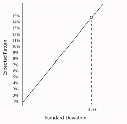
The Capital Allocation Line depicts in graph form, the fact that as you increase your standard deviation your potential return also increases. The CAL is created by looking at all potential investment pools of investments along with their expected return’s versus standard deviation. Here is an example:
Capital Allocation Line

As you see the portfolio I’m emphasizing has an expected return of 15%, the only problem is the standard deviation is 32%. This mean’s if I’m comfortable potentially losing 17%, this is a good portfolio, if not it’s bad.

Diversification

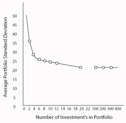
Most people think that blind diversification will protect them from risk. They think it is a good idea to randomly add different investments to their portfolio. Wrong!

As you can see in this chart, if a computer randomly pulls together a portfolio, you are no longer able to minimize Standard Deviation simply through diversification after you reach 20 random investments. I then continue to show you the result’s with 100, 200, etc.
Diversification

The Efficient Frontier

Now we are getting into a territory your stock broker probably doesn’t even understand. If we chart the following:

Every investment based on it’s expected return versus standard deviation

Every portfolio including the best of these investments

We get the following graph.
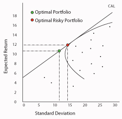
Optimal Portfolio

I’ve already described what the CAL line is.
The little dots represent all of the investment opportunities out there.
The line that curves away from the CAL is known as the Efficient Frontier. It represents all portfolio’s with the best return at the lowest standard deviation.
The Optimal Portfolio represents the point in which you are getting the best return at the lowest risk level.

The Optimal Risky Portfolio represents the point at which you receive the highest return versus all other possible portfolio mixes.

If you are a bit confused don’t worry. It comes down to this simple concept. We want to create a portfolio that will provide the best return, with the lowest amount of risk. That’s it! But, how is the optimal portfolio created? If you understand standard deviation, there is just one more piece to this puzzle. Covariance!

Covariance Analysis

I wrote in the last article about how when some stock’s go up others tend to go down. A candy companys growth potential is directly related to the price of sugar. So if sugar price’s sky rocket, chances are the candy companys stock will fall.

This is known as Covariance. It’s a measure of the degree to which two assets value’s move in tandem. If 2 stocks have a negative covariance that means they move more opposite from one another.

So one way to hedge risk in one asset is to find the other assets that effect it’s value and add them to the portfolio. This act helps to minimize standard deviation.

Wrapping Up

As mentioned before, a hedge fund named NWQ (North West Quadrant) made huge returns based purely off of creating Optimal Portfolio’s. Their name refers to the Efficient Frontier. They constantly readjusted their portfolio’s based off of expected changes in expected return’s and standard deviations.

They did this with computers, but the computer sitting in front of you now is probably as fast as the one they used back in the 90’s. In future articles I plan on showing you the math behind this article. It really isn’t that complicated. You just need to plug in day to day price changes for all of your investments. They then provide you with the investment’s:

  • Standard Deviation
  • Covariance in Relation to the other Investment’s
  • The Expected Return

Then all you have to worry about is general market risk. As history has shown us though, market risk only will effect you 6% of the time with the right asset mix.

And, if you think doing all this is way to complicated, in my opinion, don’t buy stock if you don’t want to do it intelligently. If you think a brokerage house will do this research for you, I say again good luck!

If you have any question’s leave them in the comment section below.

Here to Serve

Think Tank

The Stock Market is Dead

The Stock Market is Dead

I want to start this article, by explaining what I mean by dead. The stock market is no longer what it was. Long term investing is dead. By and hold are dead. It is my opinion, that only a very sophisticated investor can make money in the market now. The problem is that brokerage house’s keep telling everyone that the old days will come back.

I received a direct mail piece from a brokerage company last week and it took me back to the old day’s. I used to be a stock broker and one day I started to wonder about our marketing. Why did we only show the performance of the stock market from 1980 to 1999? The piece I received last week, did the same thing. It’s 2010! Why not show the performance for the last 10 years?

The reason is that the Dow Jones Industrial Average grew by 13.99% year over year during that period. This growth rate historically was off the charts!

What is the average return of the Dow historically you ask?

From 1897 thru 2003 the Dow grew by only 5.16% before fees! In fact the return of the market from 1897 thru 1980 is but 3.73%, which is approximately the average rate of inflation. The real rate of inflation, not the made up inflation number the government now uses.

I have the chart’s to prove all of this below. I used this time period (1897-2003), for a couple of reason’s:

  • I had this information on hand.
  • In 2003 the market was roughly where we are today, being that the Dow is floating between 9800 to 10,000.
  • I didn’t want you to think about the financial disaster of last year and now.

Click the chart below and then zoom in to see the whole story of the Dow Jone’s Industrial Average.

Dow Jone's Historical Performance

I think this pretty much kill’s the idea of long term investing. The market has done nothing for 10 year’s.

Broker’s Know How to Make Money Right?

Major brokerage companies cannot consistently even beat the long term returns of the Dow Jones Industrial. Want some proof to back that up? Here again are stat’s based off of performance from 1993 to 2003 instead of the current mess. They couldn’t make money back then either. (Note: For fund’s that didn’t exist in 1993, I provide since inception result’s)

Fund Results 2

This information is almost un-believeable. Remember, these number’s are even worse today. To break this down, these mutual fund return’s were provided on a 10 year or a from inception return. Here is how they performed:

  • 61.3% of these fund’s lost 20% or more
  • Only 3.3% provided a return of over 7%

Even the supposed best mind’s on Wall Street being Goldman Sach’s gave their wealthy customer’s bad advice 77% of the time. Bloomber recently reported “Seven of the investment bank’s nine recommended top trades for 2010 have been money losers for investors who adopted the New York-based firm’s advice!”

Investing in the Past

When I was a broker, I was taught by some very wise older broker’s how to invest in the stock market. You have no doubt heard of Asset Allocation. Asset Allocation is nonsense! It is based off of the real way to invest, which is called Covariance Analysis.

Through Covariance Analysis, you create efficient portfolio’s made up of stock’s, bond’s and short selling, for risk aversion. The ultimate goal being, to create a portfolio of investment’s that provide the greatest return at the lowest risk.

Here is a brief example. Let’s say you own Hershey stock. You notice that when Hershey falls in value, sugar rises in value on average. If you added sugar to your portfolio, you would then lower your overall risk level. This would be a more efficient portfolio.

Now imagine if you did this by looking at how all investment product’s perform. You could create the ultimate efficient portfolio! One hedge fund actually did just this for many years producing average return’s of 19%, with not a single loss sense inception. They were called NWQ. They were bought by Goldman a few year’s back.

The New Way, Sorry you Can’t Do This

Well that was the old way to invest. It still would work much better than how most people invest today, but from what I’m seeing there is a much more profitable way. It seems to be legal to front run? Front running is when you know someone is planning on making a big investment, so you buy in ahead of them and then sell at the inflated price soon after.

Also, we are aware of how derivative’s have been used to buy insurance on the soon to be dead. If you want to learn how derivative’s and swap’s work, read my article What are Derivative’s & Swap’s.

Why Did the Market Go Up in the 1980’s

Your probably wondering why I have waited so long to talk about this. So, that I don’t turn this into a political blog I’ll just say two word’s: Political Reason’s! Both Democrat’s and Republican’s are at fault in my opinion.

That’s All Folk’s

If you have any question’s leave them in the comment section below. I made this article, because I received request’s for more article’s on investing. I’m working on a Efficient Portfolio article as we speak! It should be fun.

Here to Serve

Think Tank